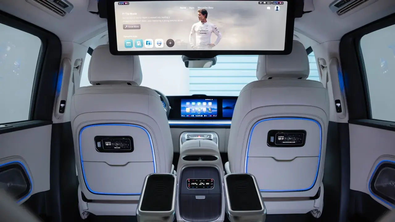
Big Screens, Better Browsing: Display Scaling in AABrowser on Large Head Units
Car screens have grown from apologetic seven-inch panels to dashboard-dominating displays wider than some home monitors. AABrowser's pages must stretch across that variety, and when scaling is wrong the symptoms are unmistakable: text for ants, pages floating in a sea of margin, or controls too large to fit anything else. Start with AABrowser official site if you want the complete picture first.
Display behaviour is a negotiation between the browser's settings, the page's own design, and the head unit's resolution. Understanding which party controls which part of the picture lets you fix almost any layout oddity in minutes.
This guide explains scaling in plain terms, how to tune text and zoom for readability, when desktop layout helps on a big screen, and how to diagnose pages that refuse to look right.
Why Pages Render Differently in Cars
Websites choose their layout based on the width the browser reports, so the same page can arrive as a phone layout, a tablet layout, or a full desktop design depending on settings.
Large head units expose this because they have the width for desktop layouts but the viewing distance of a car, a combination page designers never specifically imagined.
Your tools are the browser's scaling and display options, the page zoom, and the choice between mobile and desktop presentation where the browser offers it.
Set Scaling for Readability First
Start from the principle that car text must be readable at arm's length plus a dashboard: larger than feels necessary when holding a phone.
Raise the browser's text or page scaling until body text in a normal article is effortlessly readable, then check that buttons and links remain comfortably tappable.
Scaling is per-setup, not per-taste: a setting perfect on a 10-inch unit may be absurd on a 15-inch widescreen, so tune for your own dashboard.
Desktop Layout on Widescreens
On genuinely wide displays, requesting desktop versions of sites can unlock multi-column layouts that use the space properly, especially for news, forums, and reference pages.
Desktop pages also bring desktop problems: small links, hover menus, and dense tables, which is why the experiment should be per-site rather than a global religion.
Keep mobile layout for anything you tap often; save desktop layout for reading-heavy pages where width is the whole point.
- Readability before density
- Desktop layout per-site, not global
- Check tap targets after scaling
- Widescreens reward news and reference pages
Fix Pages That Look Wrong
A page squeezed into a narrow column usually believes the screen is a phone; toggling the desktop option or rotating the reported width through settings usually persuades it otherwise.
A page overflowing sideways often has a fixed-width design; zooming out one step and scrolling deliberately is the pragmatic answer for an occasional visit.
If one site consistently misbehaves while others behave, the fault is the site's design, and the phone remains the better tool for that particular page. You can explore this in more depth in the How to Configure AABrowser | Best Settings for Android Auto.
Split Attention: Screen Size and Safety
A bigger screen tempts longer looks, which is exactly why its settings matter: everything essential must be graspable in a glance.
Larger tap targets and shorter interactions are safety features disguised as convenience, and a well-scaled display delivers both.
As always, reading anything substantial is a parked activity; scaling simply makes parked reading pleasant and on-the-move glances brief.